We’ve all experienced the panic that sets in before a big presentation. Did I practice enough? Is my presentation too long? Too short? Am I prepared for the dreaded “questions” section at the end? Presentations are a stressful but necessary component for businesses in all industries. So important that Forbes found 70% of employed Americans say presentation skills are critical for career success. So how can you stack the odds in your favor? One word.
Canva.
If you read my last blog post about Canva, you’re probably already exploring all of the unique projects you can create using the tool. By far one of my favorite uses for Canva is designing custom presentations! In fact, I used Canva to create our most recent webinar presentations, The 5 Biggest Mistakes Technology Companies Make in Sales & Marketing – And How to Fix Them & Facts & Figures, No Fluff: Answers to the Top 5 Content Marketing Challenges for Manufacturers.
Canva has a number of templated designs that make creating a presentation easy. I’ve put together 7 tips that can help make sure your presentation goes from painful to professional.
Tip #1: Don’t jump straight into Canva! Get started with an outline and rough script.

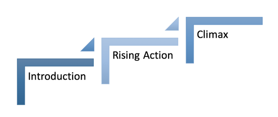
Think back to grade school and lessons on crafting a compelling story. Every story should begin with an introduction, transition into the rising action, and lead the reader to the climax. Your story should then move to the falling action and conclusion. The same writing lessons apply to your presentations! Before you head straight to Canva, you should begin with a script. Your presentation should introduce the speakers and give a clear indication of how long you expect the presentation to go.
Tip #2: Use Canva’s Presentation Design School.
Not quite a design pro? Don’t worry, Canva’s got you covered. From choosing easy-to-read fonts to creating a compelling cover slide – Canva’s put together their list of the top 10 tips for using their templates. Not only does Canva’s Design School teach you how to create presentations, but it can also provide valuable information on how you can expand the reach of your PowerPoint through promotional channels.
Tip #3: Pick a Canva template as inspiration.
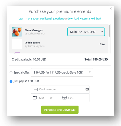
You don’t have to go it alone! You can create your own design, but Canva has a number of beautiful options to choose from to help save you time. If you hover your mouse in the top right corner of the presentation, you can see how many matching slides the presentation has. In the bottom right corner, you’ll also be able to see if the presentation is a free or a paid design. If you choose a paid design, you can edit your presentation for 24 hours. You can choose to pay $1 for each paid element (generally photos) or pay $10 for multi-use.

Tip #4: Research examples on the Web.
Get to Googling! This tip may go without saying, but look beyond Canva for inspiration. Especially if you’d prefer not to pay for Canva's premium features. With a little tweaking, you can reproduce some of Canva'a paid elements on your own. Here are a few great resources to get you started:
SlideShare is also an amazing resource for Powerpoint Design. SlideShare will allow you to search by topic and vertical. It’s also a great resource for promoting your presentation once it’s completed!
Tip #5: Pick a central consistent theme.
Consistency throughout the presentation is going to be the difference between a professional design and something that looks... homemade. Everything from the colors to the font should remain consistent throughout the entire presentation. Canva says it best in their design school:
“Keep the look of slides consistent. Images, color schemes, background images, fonts, layout, framing and logo placement should all follow the same style guide. But they also need to be kept interesting, so think of your slides as fraternal twins, not identical twins.
Some tips for consistency:
- Use the same ‘banner’ or title font throughout your design.
- Use the same ‘frame’ or ‘grid’ throughout your design.
- Use the same background throughout your design.
- Use consistent fonts.”
Tip #6: Follow Guy Kawasaki’s 10-20-30 Rule as much as possible.
Social influencer and brand evangelist Guy Kawasaki believes that presentations should have ten slides, last no more than twenty minutes, and contain no font smaller than thirty points. In many cases, this may be difficult to follow, especially in the case of webinars or proposals. However, keeping things short and simple is something every presentation attendee can appreciate. Guy’s tips are largely meant for venture capital presentations, but he recommends this basic outline:
- Problem
- Your solution
- Business model
- Underlying magic/technology
- Marketing and sales
- Competition
- Team
- Projections and milestones
- Status and timeline
- Summary and Call-to-Action
Not all presentations can follow Guy’s format, but it certainly can work as a starting point as you begin your presentation script.
Tip #7: Keep your presentation interesting with Canva’s icons & charts.
We’d all love to tap into professional design resources to add a little flare to our presentations. In lieu of a design budget, take advantage of the icons and charts in Canva’s “Charts” Tab. Social proof—such as data and statistics—helps demonstrate your points and build trust with your attendees. Don’t let all your research go to waste! Using the Charts feature in Canva is a great way to highlight important statistics while adding visual interest to your presentation.
Hopefully you’re feeling a little more confident about your presentation than you were at the beginning of my post. If you’re still struggling to conceptualize your presentation, check out our Visual Portfolio for ideas and insights. There you’ll find projects for B2B businesses in all verticals. Let our white papers, websites, CTAs, and emails help you better define the direction of your PowerPoint. As much as we all would like an army of designers at our fingertips, sometimes we have to go it alone! Lucky for you, you don’t have to do it completely alone. Reach out to us if you have any questions!


